I’ve recently started getting a personal website together for maths and physics notes, somewhere that I can dump work in progress and half-baked scraps of intuition for various concepts.
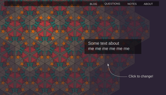
For no good reason, I decided that this should also incorporate a completely irrelevant programming idea I’d been playing around with, where I dynamically generate kaleidoscope patterns. Like this:
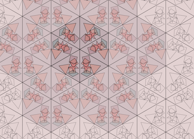
(There’s a click-to-change version over on the website itself.)
I’d been working on this on and off for some time. It’s obviously not the most important problem I could be thinking about, but there was something about the idea that appealed to me. I originally thought that this would be a programming project, and that the problems I would need to solve were mostly programming ones. The open questions I had before I started were things like:
- how would I represent the data I needed to describe the small shapes?
- how would I generate them uniformly within the big triangles?
- how would I make sure they didn’t overlap the boundaries of the big triangles?
I would say that in the end these sort of questions took up about 10% of my time on the project. Generally they were easy to solve, and generally it was enough to solve them in the simplest, dumbest possible way (e.g. by generating too many shapes, and then discarding the ones that did overlap the boundaries). That side of the project is not very interesting to describe!
Maybe another 30% was the inevitable annoying crap that comes along with web programming: fixing bugs and dodgy layouts and dealing with weird browser inconsistencies.
What surprised me, though, was the amount of time I spent on visual design questions. Compared to the programming questions, these were actually quite deep and interesting. I’d accidentally given myself a design project.
In this post I’m going to describe some of my attempts to solve the various problems that cropped up. I don’t know anything much about design, so the ‘discoveries’ I list below are pretty obvious in retrospect. I’m writing about them anyway because they were new to me, and I found them interesting.
There’s also a strong connection to some wider topics I’m exploring. I’m interested in understanding the kind of techniques people use to make progress on open-ended, vaguely defined sort of projects, and how they tell whether they are succeeding or not. I’ve been reading Donald Schön’s The Reflective Practitioner, which is about exactly this question, and he uses design (in this case architectural design) as a major case study. I’ll put up a review of the book in a week or so, which should be a good complement to this post.
I’m going to go for a fairly lazy ‘list of N things’ style format for this one, with the headings summarising my various ‘discoveries’. I think this fits the topic quite well: I’m not trying to make any deep theoretical point here, and am more interested in just pointing at a bunch of illustrative examples.
Get the models out of your head
I actually started this same project a couple of years ago, but didn’t get very far. I’d immediately tried coding up the problem, spent a while looking at some ugly triangles on a screen, got frustrated quickly with a minor bug and gave up.
I”m not sure what made me return to the problem, but this time I had the much more sensible idea of prototyping the design in Inkscape before trying to code anything up. This turned out to make a huge difference. First I tried drawing what I thought I wanted in Inkscape, starting with the initial scene that I’d reflect and translate to get the full image:

It looked really crap. No wonder I’d hated staring at those ugly triangles. I tried to work out what was missing compared to a real kaleidoscope, and progressively tweaked it to get the following:
Suddenly it looked enormously better. In retrospect, making the shapes translucent was absolutely vital: that’s how you get all the interesting colour mixes. It was also necessary to make the shapes larger, or they just looked like they’d been scattered around the large triangle in a sad sort of way, rather than filling up the scene.
(My other change was to concentrate the shapes at the bottom of the triangle to imitate the effect of gravity. That turned out to be pretty unimportant: once I got round to coding it up I started by distributing them uniformly, and that looked fine to me, so I never bothered to do anything cleverer.)
Fast visual feedback makes all the difference
Once I knew what this central part looked like, I was ready to generate the full image. I could have done this by getting a pen and paper out and figuring out all the translations, rotations and reflections I’d need. But because I was already prototyping in Inkscape, I could ‘just play’ instead, and work it out as I went.
I quickly figured out how to generate one hexagon’s worth of pattern, by combining the following two sets of three rotated triangles:

Once I had that I was pretty much done. The rest of the pattern just consisted of translating this one hexagon a bunch of times:

I generated that picture using the do-it-yourself method of just copying the hexagons and moving them round the page. I was still just playing around, and didn’t want to be dragged out of that mode of thinking to explicitly calculate anything.
I was really happy with the result. Having even this crude version of what I wanted in front of me immediately made me a lot more excited about the project. I could see that it actually looked pretty good, even with the low level of effort I’d put in so far. This sort of motivating visual feedback is what had been missing from my previous attempt where I’d jumped straight into programming.
You can often solve the same problem ‘by thinking’ or ‘by doing’
I gave a simple example of this in my last post. You can solve the problem of checking that the large square below has a side length of 16 by counting the small squares. Instead of putting in this vast level of mental effort, I instead added the four-by-four squares around it as a guide:

Four is within subitizing range, and sixteen is well outside of mine, so this converts a problem where I have to push through a small amount of cognitive strain into a problem where I can just think ‘four four four four, yep that’s correct’ and be done with it. (‘Four fours are sixteen’ also seems to ‘just pop into my head’ as a fairly primitive action without any strain.)
Now admittedly this not a difficult problem, and solving in ‘by thinking’ would probably have been the right choice – it would have been quicker than drawing those extra squares and then deleting them again. I just have a chronic need to solve ‘by doing’ wherever I can instead.
Sometimes this actually works out quite well. In an earlier iteration of the design I needed to create a translucent overlay to fit over a geometric shape with a fairly complicated border (part of it is shown as the pinkish red shape in the image below). I could have done this by calculating the coordinates of the edges – this would have been completely doable but rather fiddly and error prone.

Instead, I ‘made Inkscape think about the problem’ so that I didn’t have to. I opened up the file containing the shape I wanted to make an overlay of, and drew a rough bodge job of the outline I needed by hand, with approximate coordinates (this is the black line in the image). Then I opened up Inkscape’s XML editor containing the raw markup, and put in the right numbers. This was now very easy, because I knew from previous experience playing around that the correct numbers should all be multiples of five. So if the number in the editor for my bodged version was 128.8763, say, I knew that the correct number would actually be 130. The need to think had been eliminated.
For me, at least, this was definitely quicker than calculating. (Of course, that relied on me knowing Inkscape well enough to ‘just know’ how to carry out the task without breaking immersion – if I didn’t have that and had to look up all the details of how to draw the outline and open the XML editor, it would have been quicker to calculate the numbers.)
Go back to the phenomena
Once I got the rough idea working, I had to start thinking about how I was actually going to use it on the page. For a while I got stuck on a bunch of ideas that were all kind of unsatisfying in the same way, but I couldn’t figure out how to do anything better. Everything I tried involved a geometric shape that was kind of marooned uselessly on a coloured background, like the example below:

All I seemed to produce was endless iterations on this same bad idea.
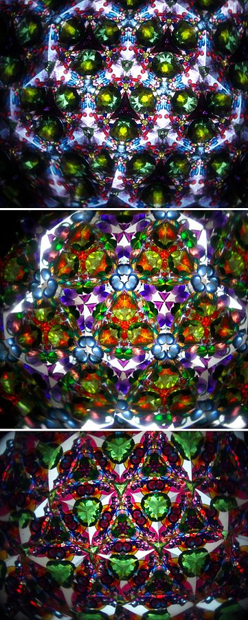
What finally broke me out of it was doing an image search for photos of actual kaleidoscopes. One of the things I noticed was that the outer rings of the pattern are dimmer, as the number of reflections increases:
That gave me the idea of having a bright central hexagon, and then altering the opacity further out, and filling the whole screen with hexagons. This was an immediate step-change sort of improvement. Every design I’d tried before looked rubbish, and every design I tried afterwards looked at least reasonably good:
Which leads to my final point…
There are much better ideas available – if you can get to them
I find the kind of situation above really interesting, where I get stuck in a local pocket of ‘crap design space’ and can’t see a way out. When I do find a way out of it, it’s immediately noticeable in a very direct way: I straightforwardly perceive it as ‘just being better’ without necessarily being able to articulate a good argument for why.
I still don’t have a good explicit argument for why the second design is ‘just better’, but looking at actual kaleidoscopes definitely helped. This was pretty similar to what I found back when I was playing with the individual shapes – adding the translucency of actual kaleidoscope pieces made all the difference.
I don’t have any great insight in how to escape ‘crap design space’ – the problem is pretty much equivalent to the problem of ‘how to have good ideas’, which I definitely don’t have a general solution to! But maybe going back to the original inspiration is one good strategy.

2 thoughts on “Practical Design for the Idiot Physicist”