Book Review: The Reflective Practitioner

In my last two posts I’ve been talking about my experience of thinking through some website design problems. At the same time that I was muddling along with these, I happened to be reading Donald Schön’s The Reflective Practitioner, which is about how people solve problems in professions like architecture, town planning, teaching and management. (I got the recommendation from David Chapman’s ‘Further reading’ list for his Meaningness site.)

This turned out to be surprisingly relevant. Schön is considering ‘real’ professional work, rather than my sort of amateur blundering around, but the domain of web design shares a lot of characteristics with the professions he studied. The problems in these fields are context-dependent and open-ended, resisting any sort of precise theory that applies to all cases. On the other hand, people do manage to solve problems and develop expertise anyway.

Schön argues that this expertise mostly comes through building up familiarity with many individual examples, rather than through application of an overarching theory. He builds up his own argument in the same way, letting his ideas shine through a series of case studies of successful practitioners.

In the one I find most compelling, an established architect, Quist, reviews the work of a student, Petra, who is in the early stages of figuring out a design for an elementary school site. I’m going to follow Schön’s examples-driven approach here and describe this in some detail.

Petra has already made some preliminary sketches and come up with some discoveries of her own. Her first idea for the classrooms was the diagonal line of six rooms in the top right of the picture below. Playing around, she found that ‘they were too small in scale to do much with’, so she ‘changed them to this much more significant layout’, the L shapes in the bottom left.

more_significant

I’m not sure I can fully explain why the L shapes are ‘more significant’, but I do agree with her assessment. There’s more of a feeling of spaciousness than there was with the six cramped little rectangles, and the pattern is more interesting geometrically and suggests more possibilities for interacting with the geography of the site.

At this point, we already get to see a theme that Schön goes back to repeatedly, the idea of a ‘reflective conversation with the materials’. The designer finds that:

His materials are continually talking back to him, causing him to apprehend unanticipated problems and potentials.

Petra has found a simple example of this. She switched to the L shapes on more-or-less aesthetic grounds, but then she discovers that the new plan ‘relates one to two, three to four, and five to six grades, which is more what I wanted to do educationally anyway.’ The materials have talked back and given her more than she originally put in, which is a sign that she is on to something promising.

After this early success, Petra runs into difficulties. She has learnt the rule that buildings should fit to the contours of the site. Unfortunately the topography of this particular site is really incoherent and nothing she tries will fit into the slope.

Quist advises her to break this rule:

You should begin with a discipline, even if it is arbitrary, because the site is so screwy – you can always break it open later.

Together they work through the implications of the following design:

screwy_site_2

This kicks off a new round of conversation with the materials.

Quist now proceeds to play out the imposition of the two-dimensional geometry of the L-shaped classrooms upon the “screwy” three-dimensional contours of the slope… The roofs of the classroom will rise five feet above the ground at the next level up, and since five feet is “maximum height for a kid”, kids will be able to be in “nooks”…

A drawing experiment has been conducted and its outcome partially confirms Quist’s way of setting the L-shaped classrooms upon the incoherent slope. Classrooms now flow down the slope in three stages, creating protected spaces “maximum height for a kid” at each level.

In an echo of Petra’s initial experiment, Quist has got back more than he put in. He hasn’t solved the problem in the clean, definitive way you’d solve a mathematical optimisation problem. Many other designs would probably have worked just as well. But the design has ‘talked back’, and his previous experience of working through problems like this has given him the skills to understand what it is saying.

I find the ‘reflective conversation’ idea quite thought-provoking and appealing. It seems to fit well with my limited experience: prototyping my design in a visual environment was an immediate improvement over just writing code, because it enabled this sort of conversation. Instead of planning everything out in advance, I could mess around with the basic elements of the design and ‘apprehend unanticipated problems and potentials’ as they came up.

I don’t find the other examples in the book quite as convincing as this one. Quist is unusually articulate, so the transcripts tell you a lot. Also, architectural plans can be reproduced easily as figures in a book, so you can directly see his solution for yourself, rather than having to take someone’s word for it. With the other practitioners it’s often hard to get a sense of how good their solutions are. (I guess Schön was also somewhat limited by who he could persuade to be involved.)

Alongside the case studies, there is some discussion of the implications for how these professions are normally taught. Some of this is pretty dry, but there are a few interesting topics. The professions he considers often have something like ‘engineering envy’ or ‘medicine envy’: doctors and engineers can borrow from the hard sciences and get definitive answers to some of their questions, so they don’t always have to do this more nebulous ‘reflective conversation’ thing.

It’s tempting for experts in the ‘softer’ professions to try and borrow some of this prestige, leading to the introduction of a lot of theory into the curriculum, even if this theory turns out to be pretty bullshit-heavy and less useful than the kind of detailed reflection on individual cases that Quist is doing. Schön advocates for the reintroduction of practice, pointing out that this can never be fully separated from theory anyway:

If we separate thinking from doing, seeing thought only as a preparation for action and action only as an implementation of thought, then it is easy to believe that when we step into the separate domain of thought we will become lost in an infinite regress of thinking about thinking. But in actual reflection-in-action, as we have seen, doing and thinking are complementary. Doing extends thinking in the tests, moves, and probes of experimental action, and reflection feeds on doing and its results. Each feeds the other, and each sets boundaries for the other. It is the surprising result of action that triggers reflection, and it is the production of a satisfactory move that brings reflection temporarily to a close… Continuity of enquiry entails a continual interweaving of thinking and doing.

For some reason this book has become really popular with education departments, even though teaching only makes up a tiny part of the book. Googling ‘reflective practitioner’ brings up lots of education material, most of which looks cargo-culty and uninspired. Schön’s ideas seem to have mostly been routinised into exactly the kind of useless theory he was trying to go beyond, and I haven’t yet found any good follow-ups in the spirit of the original. It’s a shame, as there’s a lot more to explore here.
Precision and slop together

[This was originally part of the previous post, but is separate enough of an idea that I spun it out into its own short post. As with the previous one, this is in no way my area of expertise and what I have to say here may be very obvious to others.]

‘Inkscape GUI plus raw XML editor’ turns out to be a really interesting combination, and I wish I had access to this general style of working more often. Normally I find I have a choice between the following two annoying options:

  • write code, no inbuilt way to visualise what it does
  • use a visual tool that autogenerates code that you have no control over

Visual tools give you lots of opportunity for solving problems ‘by doing’, moving things around the screen and playing with their properties. I find this style of problem solving intrinsically enjoyable, and finding a clever solution ‘by doing’ is extremely satisfying. (I gave a couple of examples in the previous post.)

Visual tools also tend to ‘offer up more of the world to you’, in some sense. They make it easy to enter a state of just messing around with whatever affordances the program gives you, without having to think about whatever symbolic representation is currently instantiating it. So you get a more open style of thinking without being tied to the representation.

A screen's worth of 'just mucking around'

On the other hand, of course, visual tools that don’t do what you want are the most frustrating thing. You have no idea what the underlying model is, so you just have to do things and guess, and the tool is normally too stupid to do anything sensible with your guesses. Moving an image in Microsoft Word and watching it trigger a cascade of other idiotic changes would be a particularly irritating example.

You also miss out on the good parts of symbolic tools. Precision is easier with symbolic tools, for example. The UI normally has some concessions to precision, letting you snap a rotation to exactly 45 degrees or 90 degrees, for example. But sometimes you just want exactly 123 degrees, and not 122 degrees or 124 degrees, and the UI is no help with that.

Most importantly, symbolic tools are much better for anything you’re going to automate or compose with other tools. (I don’t really understand how much this is inherent in the problem, and how much it’s just a defect of our current tools.) I knew that I was eventually going to move to coding up something that would dynamically generate random shapes, so I needed to understand the handles that the program would be manipulating. Pure visual mucking around was not an option.

Unusually, though, I didn’t have to choose between visual immersion and symbolic manipulation, at least at the prototyping stage. This was a rare example of a domain where I could use a mix of both. On the symbolic side, I understood the underlying model (paths and transformations for scalable vector graphics) reasonably well, and wasn’t trying to do anything outlandish that it would struggle to cope with. At the same time, it was also an inherently visual problem involving a load of shapes that could be moved and edited and transformed with a GUI tool. So I could switch between open-ended playing and structural manipulation whenever I wanted. I wish I got to do this more often!

Practical Design for the Idiot Physicist

I’ve recently started getting a personal website together for maths and physics notes, somewhere that I can dump work in progress and half-baked scraps of intuition for various concepts.

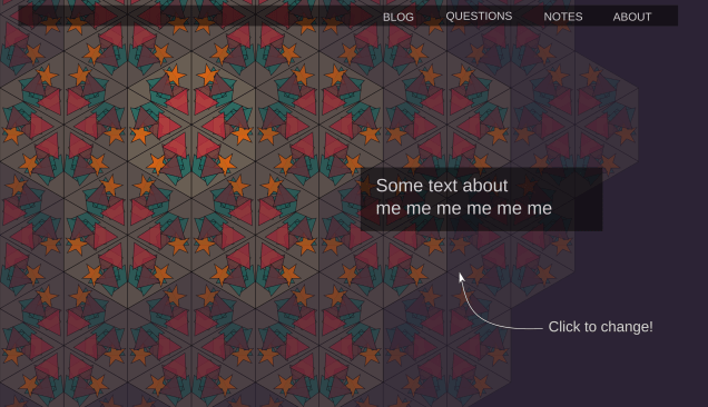
For no good reason, I decided that this should also incorporate a completely irrelevant programming idea I’d been playing around with, where I dynamically generate kaleidoscope patterns. Like this:

Kaleidoscope pattern

(There’s a click-to-change version over on the website itself.)

I’d been working on this on and off for some time. It’s obviously not the most important problem I could be thinking about, but there was something about the idea that appealed to me. I originally thought that this would be a programming project, and that the problems I would need to solve were mostly programming ones. The open questions I had before I started were things like:

  • how would I represent the data I needed to describe the small shapes?
  • how would I generate them uniformly within the big triangles?
  • how would I make sure they didn’t overlap the boundaries of the big triangles?

I would say that in the end these sort of questions took up about 10% of my time on the project. Generally they were easy to solve, and generally it was enough to solve them in the simplest, dumbest possible way (e.g. by generating too many shapes, and then discarding the ones that did overlap the boundaries). That side of the project is not very interesting to describe!

Maybe another 30% was the inevitable annoying crap that comes along with web programming: fixing bugs and dodgy layouts and dealing with weird browser inconsistencies.

What surprised me, though, was the amount of time I spent on visual design questions. Compared to the programming questions, these were actually quite deep and interesting. I’d accidentally given myself a design project.

In this post I’m going to describe some of my attempts to solve the various problems that cropped up. I don’t know anything much about design, so the ‘discoveries’ I list below are pretty obvious in retrospect. I’m writing about them anyway because they were new to me, and I found them interesting.

There’s also a strong connection to some wider topics I’m exploring. I’m interested in understanding the kind of techniques people use to make progress on open-ended, vaguely defined sort of projects, and how they tell whether they are succeeding or not. I’ve been reading Donald Schön’s The Reflective Practitioner, which is about exactly this question, and he uses design (in this case architectural design) as a major case study. I’ll put up a review of the book in a week or so, which should be a good complement to this post.

I’m going to go for a fairly lazy ‘list of N things’ style format for this one, with the headings summarising my various ‘discoveries’. I think this fits the topic quite well: I’m not trying to make any deep theoretical point here, and am more interested in just pointing at a bunch of illustrative examples.

Get the models out of your head

I actually started this same project a couple of years ago, but didn’t get very far. I’d immediately tried coding up the problem, spent a while looking at some ugly triangles on a screen, got frustrated quickly with a minor bug and gave up.

I”m not sure what made me return to the problem, but this time I had the much more sensible idea of prototyping the design in Inkscape before trying to code anything up. This turned out to make a huge difference. First I tried drawing what I thought I wanted in Inkscape, starting with the initial scene that I’d reflect and translate to get the full image:

Bad first attempt at initial scene

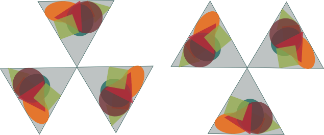
It looked really crap. No wonder I’d hated staring at those ugly triangles. I tried to work out what was missing compared to a real kaleidoscope, and progressively tweaked it to get the following:Better attempt at initial scene
Suddenly it looked enormously better. In retrospect, making the shapes translucent was absolutely vital: that’s how you get all the interesting colour mixes. It was also necessary to make the shapes larger, or they just looked like they’d been scattered around the large triangle in a sad sort of way, rather than filling up the scene.

(My other change was to concentrate the shapes at the bottom of the triangle to imitate the effect of gravity. That turned out to be pretty unimportant: once I got round to coding it up I started by distributing them uniformly, and that looked fine to me, so I never bothered to do anything cleverer.)

Fast visual feedback makes all the difference

Once I knew what this central part looked like, I was ready to generate the full image. I could have done this by getting a pen and paper out and figuring out all the translations, rotations and reflections I’d need. But because I was already prototyping in Inkscape, I could ‘just play’ instead, and work it out as I went.

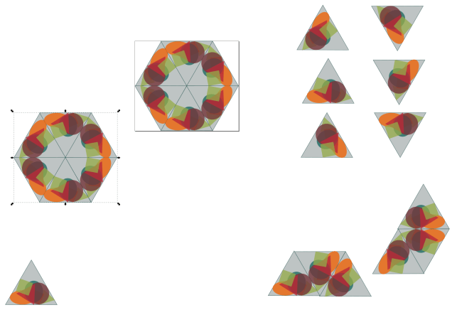
I quickly figured out how to generate one hexagon’s worth of pattern, by combining the following two sets of three rotated triangles:

Rotated and reflected triangles

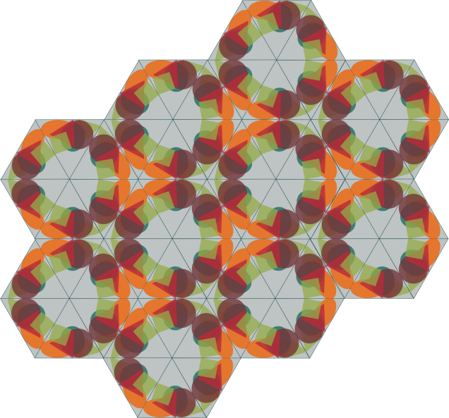
Once I had that I was pretty much done. The rest of the pattern just consisted of translating this one hexagon a bunch of times:

Tiling hexagons

I generated that picture using the do-it-yourself method of just copying the hexagons and moving them round the page. I was still just playing around, and didn’t want to be dragged out of that mode of thinking to explicitly calculate anything.

I was really happy with the result. Having even this crude version of what I wanted in front of me immediately made me a lot more excited about the project. I could see that it actually looked pretty good, even with the low level of effort I’d put in so far. This sort of motivating visual feedback is what had been missing from my previous attempt where I’d jumped straight into programming.

You can often solve the same problem ‘by thinking’ or ‘by doing’

I gave a simple example of this in my last post. You can solve the problem of checking that the large square below has a side length of 16 by counting the small squares. Instead of putting in this vast level of mental effort, I instead added the four-by-four squares around it as a guide:

16 by 16 square, with 4 by 4 squares around it as a guide

Four is within subitizing range, and sixteen is well outside of mine, so this converts a problem where I have to push through a small amount of cognitive strain into a problem where I can just think ‘four four four four, yep that’s correct’ and be done with it. (‘Four fours are sixteen’ also seems to ‘just pop into my head’ as a fairly primitive action without any strain.)

Now admittedly this not a difficult problem, and solving in ‘by thinking’ would probably have been the right choice – it would have been quicker than drawing those extra squares and then deleting them again. I just have a chronic need to solve ‘by doing’ wherever I can instead.

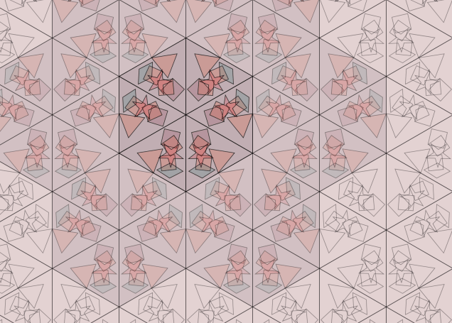
Sometimes this actually works out quite well. In an earlier iteration of the design I needed to create a translucent overlay to fit over a geometric shape with a fairly complicated border (part of it is shown as the pinkish red shape in the image below). I could have done this by calculating the coordinates of the edges – this would have been completely doable but rather fiddly and error prone.

Drawing a line around the rough border of the shape

Instead, I ‘made Inkscape think about the problem’ so that I didn’t have to. I opened up the file containing the shape I wanted to make an overlay of, and drew a rough bodge job of the outline I needed by hand, with approximate coordinates (this is the black line in the image). Then I opened up Inkscape’s XML editor containing the raw markup, and put in the right numbers. This was now very easy, because I knew from previous experience playing around that the correct numbers should all be multiples of five. So if the number in the editor for my bodged version was 128.8763, say, I knew that the correct number would actually be 130. The need to think had been eliminated.

For me, at least, this was definitely quicker than calculating. (Of course, that relied on me knowing Inkscape well enough to ‘just know’ how to carry out the task without breaking immersion – if I didn’t have that and had to look up all the details of how to draw the outline and open the XML editor, it would have been quicker to calculate the numbers.)

Go back to the phenomena

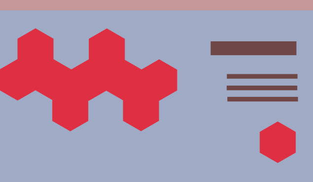
Once I got the rough idea working, I had to start thinking about how I was actually going to use it on the page. For a while I got stuck on a bunch of ideas that were all kind of unsatisfying in the same way, but I couldn’t figure out how to do anything better. Everything I tried involved a geometric shape that was kind of marooned uselessly on a coloured background, like the example below:

Bad initial design for page

All I seemed to produce was endless iterations on this same bad idea.

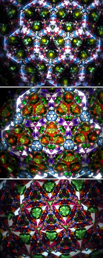
What finally broke me out of it was doing an image search for photos of actual kaleidoscopes. One of the things I noticed was that the outer rings of the pattern are dimmer, as the number of reflections increases:

Actual kaleidoscopes

(source)

That gave me the idea of having a bright central hexagon, and then altering the opacity further out, and filling the whole screen with hexagons. This was an immediate step-change sort of improvement. Every design I’d tried before looked rubbish, and every design I tried afterwards looked at least reasonably good:

Improved design for page

Which leads to my final point…

There are much better ideas available – if you can get to them

I find the kind of situation above really interesting, where I get stuck in a local pocket of ‘crap design space’ and can’t see a way out. When I do find a way out of it, it’s immediately noticeable in a very direct way: I straightforwardly perceive it as ‘just being better’ without necessarily being able to articulate a good argument for why.

I still don’t have a good explicit argument for why the second design is ‘just better’, but looking at actual kaleidoscopes definitely helped. This was pretty similar to what I found back when I was playing with the individual shapes – adding the translucency of actual kaleidoscope pieces made all the difference.

I don’t have any great insight in how to escape ‘crap design space’ – the problem is pretty much equivalent to the problem of ‘how to have good ideas’, which I definitely don’t have a general solution to! But maybe going back to the original inspiration is one good strategy.